
Instagram gets a new look with redesigned wordmark
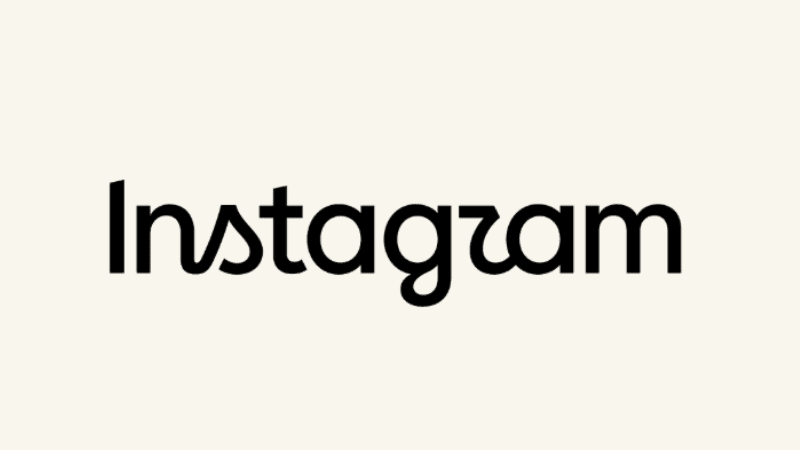

Instagram has unveiled a refreshed version of its iconic wordmark, giving the social media platform’s name logo a cleaner and more contemporary appearance while retaining its distinctive script-style identity.
Meta, Instagram’s parent company, introduced the redesigned wordmark on Thursday (August 13), describing it as a subtle evolution of the brand rather than a complete visual overhaul.
Instagram head Adam Mosseri said the wordmark displayed at the top of the app had remained largely unchanged for about a decade. The latest update introduces subtle adjustments to the shape and proportions of the letters to give the logo a more modern feel while preserving its familiar character.
The change follows Instagram’s last major visual redesign in 2016, when the platform replaced its brown camera logo with the now-familiar pink-and-orange gradient icon.
This time, the update is limited to the wordmark rather than the camera icon. The redesigned lettering has already sparked mixed reactions online, with some users praising its cleaner appearance while others have responded with jokes and criticism over the new typeface.
Leave A Comment